One of the toughest challenges facing the hotel industry is the ever-increasing need to drive direct bookings—as shares to third parties rise, so do the stakes for hoteliers too. One important, and overlooked aspect in the effort to drive bookings is a property’s website and its effectiveness to convert travelers. Studies show that hotels that fail to spend time and money on their websites face a drop in bookings and, as a result, profitability.
In order to create a website that converts, center your planning around three key features:
- Simplicity
Finding the line between giving too much information and too little is a balancing act necessary for a simple, seamless purchase experience. - Readability
The ease at which a visitor can navigate the page, get the information they need, or find the service they’re looking for creates a readable and friction-free experience for users. - Branding
A hotel’s brand is its unique identity and can be expressed through a variety of factors, including images, content, logo, and external communication (e.g. email, social media, etc.)
Design
The best way to get a nice website is to hire a good web designer, but you can’t let everything on his hands, you need to come up with the specifications and the concept,that’s why you should consider some features:
-Choose a color palette. Preferably 2-3 key colors.
-Decide on one font.
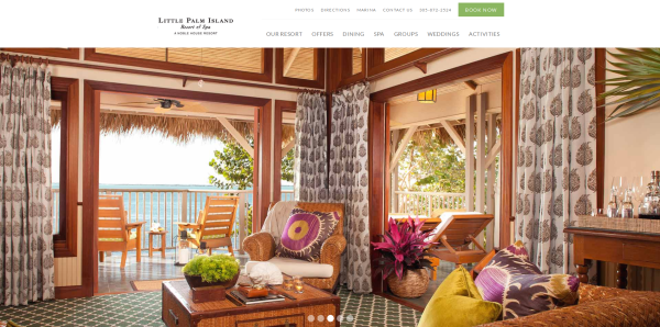
-Have a clean site, that is easy to navigate and provides on-point information;
-Show your offerings in an attractive way positioned on the homepage.;
-Have your social media buttons in close reach;
-Easily to find booking system;
-Menu that is visible,readable and easy to navigate;
If it’s not immediately clear where guests can book on the homepage, the design isn’t simple enough.
Everything from the logo to your booking engine should be related to your brand. But make sure that you’re not overdoing it.
Images
A picture is worth a thousand words, so ensure your photos are high-quality, focus on your property’s key features.
In order to keep your images simple, try to capture images that are unique to your hotel, like your central location or special spa offerings. Also, avoid people in your photos.
Your photographs should be more than just educational, they should be inspirational. To stay on-brand, your photos need to inspire people to book at your unique hotel, not just for the nearby attraction.
If your hotel isn’t located by a key landmark, like at the foot of Mt. Fuji, provide interior shots—ideally hotel rooms since that is what guests actually pay for.
Content
Make a list of 10 things you want every guest to know about your hotel. Now, cut that list in half. Use these five key features as the backbone of your website amenities and descriptions.
Resist the temptation to say everything all at once. If a customer is trying to find the location of your hotel which you describe as: “Deeply in the heart of the woods,” their question isn’t answered and they’re likely to leave your site. Instead, be clear: “Located 5 miles from from the airport.” While there is a place for descriptive language in your content, don’t let it get in the way of readability.
Content is one of the most important aspects of a website because it can improve visibility on search engines, communicate your unique brand, and educate potential guests on services and amenities.
Refreshing your content is important because search engines, like Google, check (or crawl) websites looking for fresh content. New content boosts your Search Engine Optimization (SEO) ranking because it shows you’re an engaged and active participant on the internet.
In order to get your content to convert:
Don’t overpromise. It’s important to set guest expectations at the very beginning, starting with how you describe your hotel. Be sure to use words that accurately describe your services and amenities.
Avoid unnecessarily or distracting fluff. This is probably one of the most common mistakes. You have a great spa, or an ideal location, and want everyone to know it. So, you write a lengthy description of your location or amenities that is stuffed with adjectives:
• “Cozy ambiance with…”
• “Teaming with charm and delightment…”
These phrases are problematic as they offer little educational information. Too many descriptives make it sound too good to be true, or difficult to fully assess.
Use contrasting colors that are pleasing to the eye. Avoid grey for the text of the call to action button because it is associated with dead links.
Don’t use the same color in your CTA as the background—it gets lost.
Don’t put too many CTAs on one site—visitors are overwhelmed when asked to do too much.
Try new CTAs every few months in order to see what works and what doesn’t.
Don’t be overly wordy—two to three words is best.
Boost your SEO
Use keywords: Think about your avatar and what they would search for on Google. Then, incorporate those phrases into your content. You don’t want to overstuff them— Google actually searches for people who do that and penalizes them. Rather, use those phrases as a guide in your descriptions.
Create engaging content: Provide educational and valuable content, that will definitely help your SEO. Providing educational, valuable content will only help your SEO. For example, posting a weekend itinerary on your website is helpful for booked and potential guests to plan their weekend. It can also be useful for SEO—people who are looking to stay in your city for a weekend can have your list pop up in their results and inspire them to book with you.
Link building: Link building is another great way to improve SEO, it means linking to other websites, more exactly people linking to your site, and you linking to other sites.
Always keep improving
Include reviews: Highlighting a few key reviews of your property or rooms gives a trustworthy account of your offerings.
Make your website mobile friendly: Nowadays most people are surfing the internet from their smartphone. Actually
65% of hotel reservations are made from a smartphone. With so many people booking online, it’s a must to have a mobile friendly website.
Analyze how good your website is doing by asking yourself the following:
Is your navigational menu easy to find?
Is your booking button prominent and easy to locate?
Are your photos high-quality?
Do you have less than five design elements?
Does it reflect your brand?
You have one clear, prominent Call to Action
You’ve refreshed your Call to Action within the last six months
Your Call to Action has two contrasting colors
Your Call to Action redirects to the right page
Your amenities and descriptions are clear and informative
You bring value or answer potential questions in your content
You have helpful content on local attractions
You have hyperlinks to local/nearby attractions that you speak about
You’ve refreshed your content in the last three months
Do you have an image to accompany every room?
Do you have a brief (one sentence) description for each room?
Is your calendar easy to read and use?
Do you feature a package on your booking engine?
Is your booking page mobile-friendly?
Are you incorporating guest reviews in your booking engine?


