Nowadays a lot of small hoteliers are making mistakes on their websites that can decrease the number of incoming guests. Most of the times a good website theme is the perfect invitation of accessing the website and then to book a room.
In this article, you’ll find a list of the top 20 mistakes and the ways that you can avoid them on your website:
1. Contact number
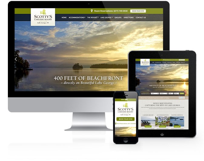
Do you know this simple expression: “Make it Simple”? You need to make it as easy as possible for guests to contact you.
In a digital era, guests need to be able to contact you in the way that they would like.
Many hotel owners are showing their contact number in the footer of the website. Well, it is not a tragedy doing that but it requires guests to scroll down and search for the number. Because time is not a good friend of us, most of the guests will find too difficult to scroll so they will give up and move on to a different hotel.
The best way to show it would be on the top right-hand corner.
2. Stop sending people away from your site
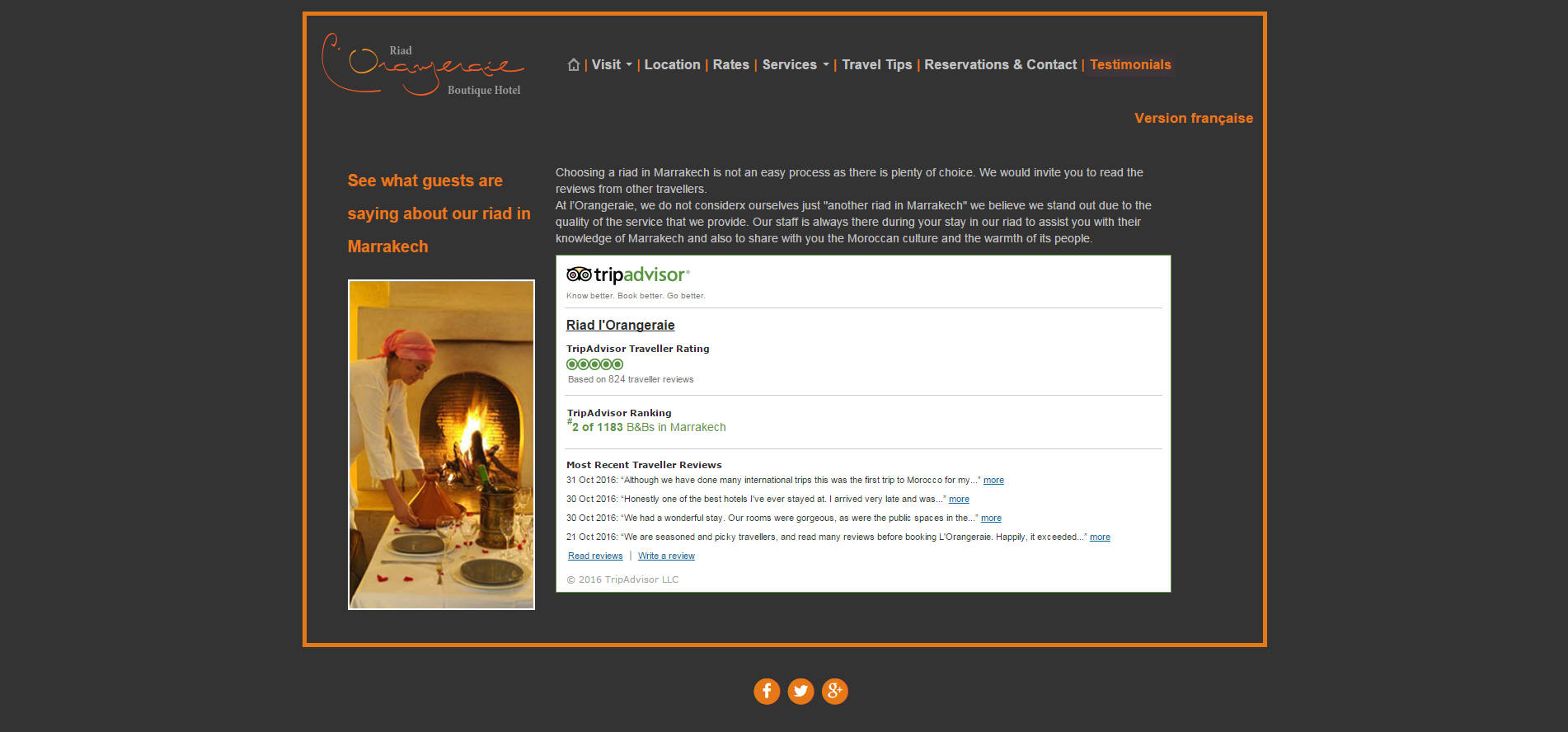
Every hotelier wants that his guests to spend time browsing their website and the best way to do this is to give possibilities for search and discover on your B&B website.
Instead of including a lot of social networks links the best way to connect social networks with the website is by embedding Facebook posts, Tweets, Instagram posts, and TripAdvisor reviews right on your website.
3. Automatic music in the background
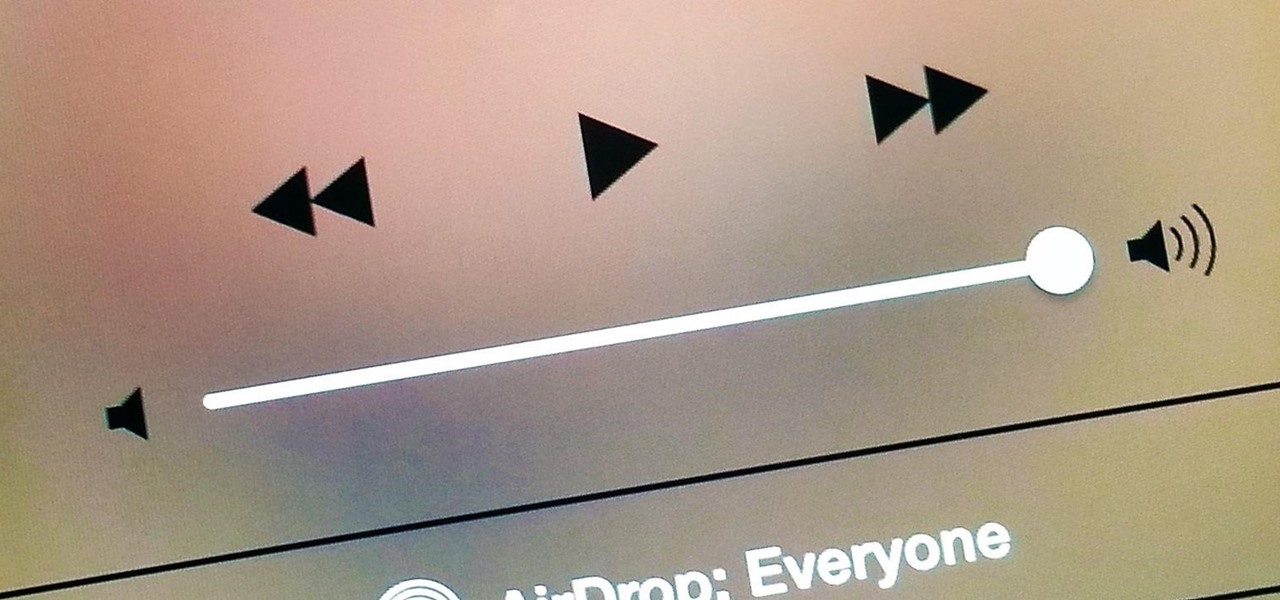
I know it’s pretty cool opening a website and listening to a good music on the background but most of the times you don’t choose the best music and because of that people do not want music to announce their arrival. In some situations, music can be a distraction from the message you are trying to communicate on your website. Besides, different people have different taste in music. So keep in mind that if a visitor does not like the music that is playing in the background, they will leave your site.
4. Booking process
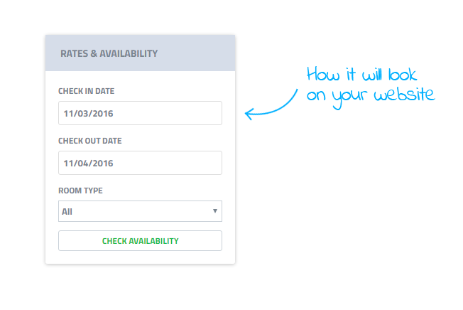
For most small hotels, the booking process is kind of difficult and they are not willing to invest a lot of money in this process. However we suggest you integrate a booking engine into your website and start making the booking process much easier. This is the first experience that your guests will have with your hotel, so it’s important to make a good first impression. Don’t stress. We can help you! HoteloPro makes it easy to organize your business, save time, and acquire more guests. In this platform, you can find a very practical and useful widget for bookings that you can integrate on your website as a plugin.
Instead of using unprofessional forms, invest a little in an automated booking engine that allows guests to book and view their availability. HoteloPro offers much more than that but we would like to let you discover more.
If you’re considering investing in an application that can save your time and acquire more clients, please let us know in the comment section bellow. (Maybe you are the next lucky girl/guy who can get a discount)
5. Too much text
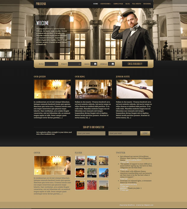
Having too much text without photos on the website is enough to make your guests bored or just leave.
When guests are booking a B&B, they want to see photos. Much more than that try to keep the text short and to the point. Don’t forget to include photos of each room if they are different.
6. Calls-to-Action

The main goal of a business is to accomplish the target. The main goal of your small hotel website is to make as many bookings as possible. Your website is a tool for getting customers through your door.
If you are starting throwing multiple calls-to-action to the guests they will start to be confused. Keep your home page clean and simple with one call to action for checking availability and book.
7. Social media confusion

Social networks, such as Facebook, Twitter, LinkedIn, and Instagram, are a great way for you to promote your B&B.
Those platforms allow you to target the audience you want. But keep in mind that loading your website with social media icons can lower from your goal of making as many bookings as you can.
Because of those reasons, it is relevant to be careful about your positioning of social media icons.
8. Disabling the back button
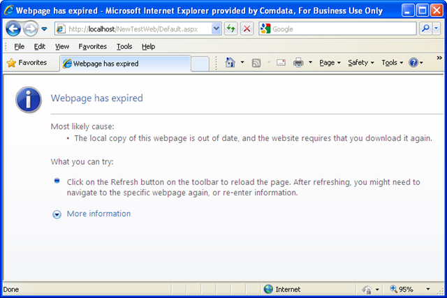
Why would you like to do that ? Tell me that you don’t want to irritate your visitors, by blocking the back button on the browser? Web Developers during the web designing process have found a way to disable the back button and redirect pages to different menus from the original web page. It’s frustrating when you can’t go back and this is perceived as an abusive “marketing tool” of keeping visitors on a website.
9. Broken links and a slow server
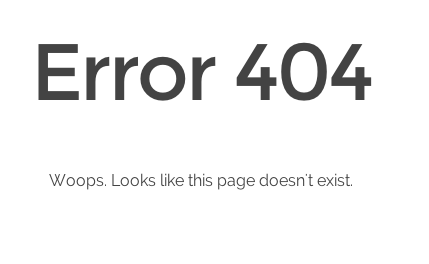
How would you feel when you click on a link on your favorite website and it appears it does not exist?
If you know that something does not work properly on your website, now is the right time to make sure you eliminate all dead links before your visitors see them.
Also, don’t forget that a slower server is an important issue to fix as soon as possible. So if your page does not load in less than 2 seconds, then it may lead to angry guests which are pulling out of your website.
10. Website with outdated information

I hope this does not exist anymore, but just let’s suppose that you have outdated information on your website. Your guests don’t want to read outdated information. So make sure you keep the website updated with relevant content.
11. Missing your target

As a small hotel owner, you understand how important it is to know your target audience. For sure you spent hours creating a custom audience and figuring out how to attract guests attention. The way your website looks will attract a certain type of visitor. Some websites are highly professional, some are contemporary, while others are the worst nightmare. Sometimes it happens that a website tries to speak to many audiences. Trying to hit more targets with one arrow it’s from begging a wrong action. If you try to please too many customers, you’ll end up with a muddled website. Try to identify the profile of your guests and start to build a great web design.
12. Too many ads placed wrong
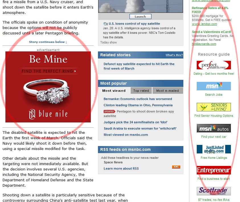
In a publicity era where ads are all over the place, advertising became a necessity in the web design world and especially on blogs, where the main income comes to the writer. However, I’m begging you to understand that too many ads or noisy flashy ads will frustrate your guests and you’ll lose them. You have to inspire trust. Don’t forget that you are not the market billboard.
13. Bad navigation

I know that guests should be able to find their way around easily but if a text is used as navigation, it should be clear and concise. If you are using hyperlinks, then they must stand out from the body of the text. Pay attention not to have a link on the homepage that links to the homepage.
14. Screen resolution

I’m sure all of us we have visited old websites where you had to scroll horizontally. This is absolutely no modern, old and unuseful. A good designer will know to develop your hotel websites that fit on all screen sizes. The currently optimized screen resolution for websites is 1024 x 768 pixels.
15. Stop mixing fonts
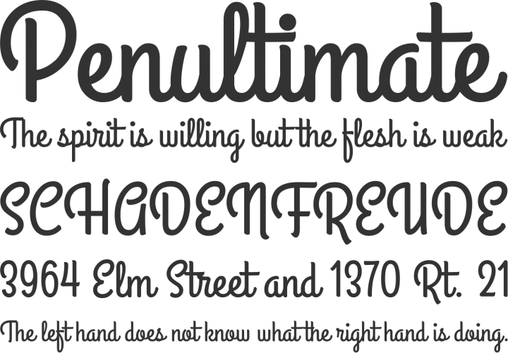
C’mon, do you find professional using Comic Sans on your website? The only thing worse than using only Comic Sans is to use a mix of different fonts.
16. Bad use of color and contrast.
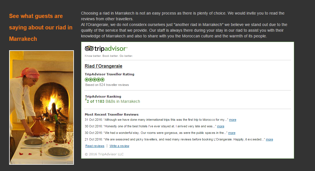
This is a common problem to most of the websites. Choosing the color and contrasts never was easy but each designer should know a bit of color theory and be able to apply the rules.
17. Pop-up windows.
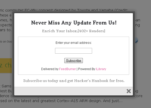
I know, I know you want to grow your guest’s database and you want to have all information about them but this will surely lead to visitor’s disorienting experience. So one pop-up window should be accessible for a better perception. By the way, the user must have the possibility to close the pop-up clicking anywhere on the screen, not on the “x” that is hidden somewhere.
18. Mobile user interface
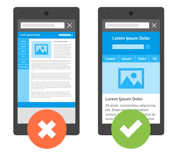
“Looks like you’re using an unsupported browser.” In a mobile era having a website, that is not compatible with mobile devices it’s like owning your hotel but having no clients. How do that sounds?
In this digital era, most people are using mobile devices to surf the internet. Start develop your hotel website to work on mobile devices.
19. Too much attention to the homepage.
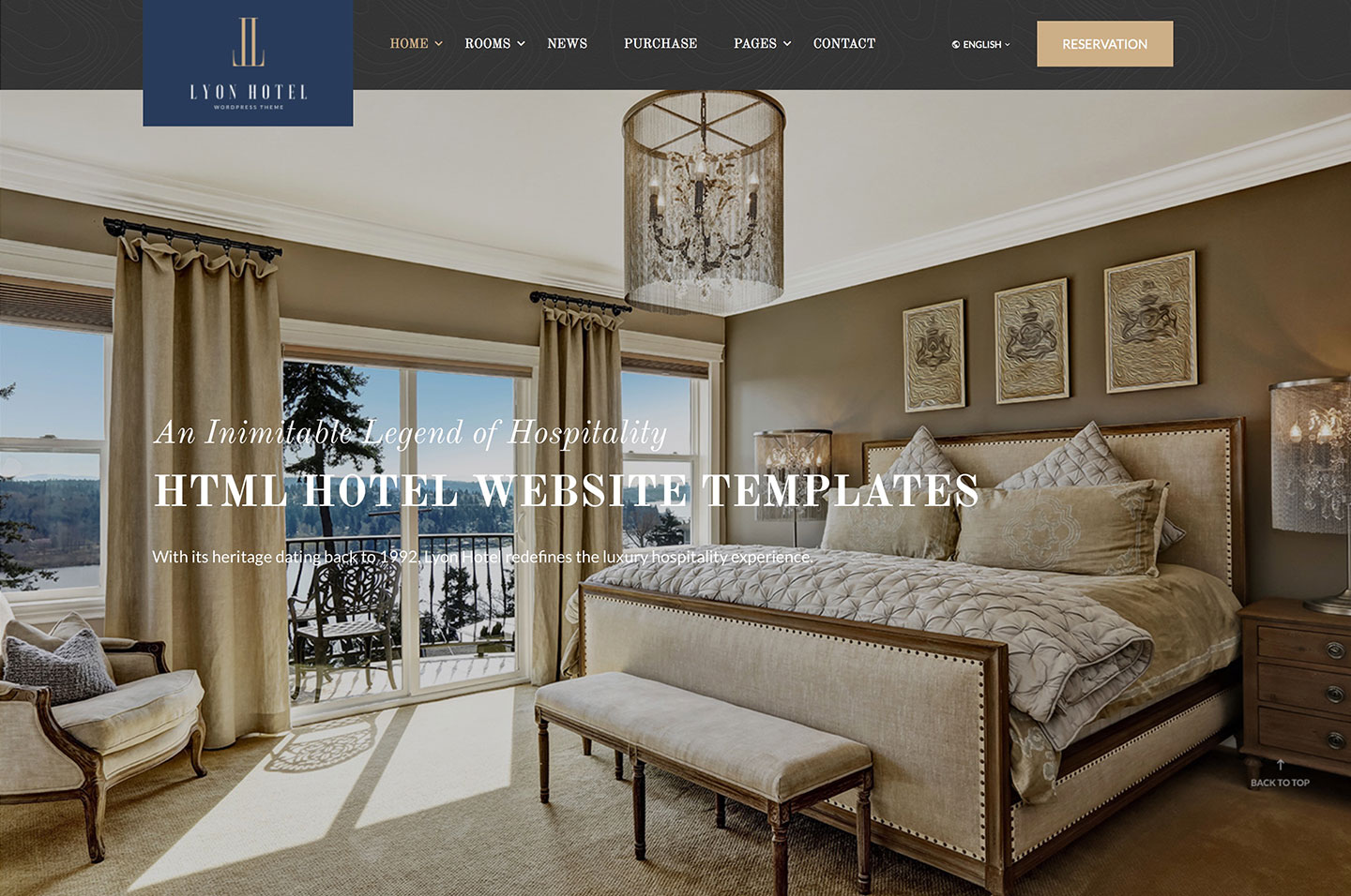
How would you like to be your first impression? I know that the home page should be marvelous. But, the subpages are not less important because they contain the essential info.
20. Weak SEO
As we told you before in the previous SEO articles, search engine algorithms are smarter than you think and value a site based on much more than all these tips. Start improving the website keywords. I know we told you in every article but start doing it now. Google’s algorithms will increase your website rating if you are starting improving now.
If you find this article useful feel free to share it with your social network. If you need more information about this subject please let us know in the comment section bellow.

